Tuesday, May 10, 2011

Geometry Fun!!


            I’m pretty sure everyone in this class had heard of the Louvre before we took Humanities.  However, if you are like me, you knew nothing about it or the magnificent architecture that encompassed the museum.  Not being a huge artsy guy, the aspect of learning about an art museum is almost nauseating for me, but after taking a look at the work of I. M. Pei with the Louvre, I think I could spend a day simply admiring his work and not even bothering with the famous art inside.  I’m a math major, so anything dealing with geometric shapes in architecture is really cool to me, which I guess is one reason why I love the pyramids done by Pei.  The largest of the pyramids is comprised of 673 glass segments (geometric kites) and is seventy feet high.

            After researching a little more about the pyramids, I discovered that the Louvre pyramid has a sister pyramid that is in an underground shopping mall in front of the Louvre.  It is called the             Inverted Pyramid and is basically the Louvre pyramid turned upside down.  The base of the pyramid is even with the ground and the point goes straight down into the building.  It serves as a super extravagant skylight for people inside and a really cool glass floor for people to walk on outside!  The point of the pyramid is actually suspended almost 5 feet off the ground.  Underneath the point is a small stone pyramid that almost reaches to the point of the inverted pyramid.  These are both simple looking pieces of architecture, but they are also extremely complex and extravagant and some of the coolest looking pieces of architecture I have ever seen.  This even surpasses Wright’s Falling Water in my opinion!


Trippy!!


            I never considered optical illusions an art form until I read about it in the text, but I suppose it does deserve the title of art.  It doesn’t look like the traditional “art” that most would think of as far as paintings and such, but it does take an incredible of artistic and creative talent to be able to do it.  It baffles me that something that is inanimate and immobile can appear to move just sitting on the page.  Whoever was the first person to realize the potential or possibility of optical illusions is a sheer genius!  Beyond the thought process and ingenius design, I think that optical illusions take as much artistic ability as a great painting.  They aren’t nearly as beautiful, but to be able to draw lines that are different widths and distances apart and make it consistent across the page just is truly impressive to me.  The one example they have in the book is Current done by Bridget Riley.  It is awesome and does resemble and even appear to flow like a current!  I was impressed enough by this piece that I looked up other pieces by Riley.  She has some other crazy works such as Movement in Squares, Cataract, and Blaze.  Each piece is the same general idea of lines and shapes that appear to move when you view them.  It almost gives me a headache looking at these, but it is worth it as these are truly amazing works of art that are extremely aesthetically pleasing.
My favorite - Blaze
Movement in Squares


Calatrava rocks!


            The Milwaukee Art Museum got a huge boost in greatness in 2001 when Santiago Calatrava came in and added his own work to the museum.  The museum had been around for a long time, but it didn’t have the aesthetic appeal that it has now until Calatrava added the Quardacci Pavillion.  Besides just looking really amazing and complex, it is very functional and obviously, a lot of thought went into the design to give it more meaning than just looking cool.

            The design does immediately make people think of sailboats, which is what Calatrava was going for.  He “worked to infuse the building with a certain sensitivity to the culture of the lake – the boats, the sails, and the always changing landscape.”  But there is more to the pavilion than just meets the eye.  After looking more into the pavilion, I found that there is a lot more to it than just the really looking design.  For one, there is a brise soleil, which is simply a really fancy way of saying a sun-blocking device.  The device has a wingspan comparable to a 747 and opens and closes several times every day.  It has automatic wind sensors that close the sunscreen if the wind speed surpasses 23 miles per hour.
            Looking deeper, I became even more impressed with Calatrava as I saw how much effort he put into the structures surrounding the pavilion that made it possible.  The footbridge that you take to the museum has a look similar to the museum and is appealing to the eye and very functional.  Even the parking garage was made to look fancy and impress people!  It is temperature controlled, has painted flowing support ribs, and has skylights in it!  It is amazing that he went to the effort to even make the parking garage an attraction and impressive.
The Footbridge
Parking Garage!

Less is a Bore!!


        I am a huge fan of the philosophy of Robert Venturi.  In his book Complexity and Contradiction in Architecture, he counters the statement that less is more with his own views that less is a bore.  I have to agree completely with him.  While simple architecture does have its place, I am a huge fan of the extravagant architecture that was displayed in the information age.  For example, the Piazza d’Italia done by Charles Moore is a really cool piece of work that is the opposite of a bore and has a lot going on.  This public plaza in New Orleans is the result of a combination of motifs borrowed from Pompeii, Paladio, and Italian Baroque architecture.  It may look gaudy at first glance; it is really a fantastic architectural collage.  I’ve never seen anything like this, where the architect took so many influences and threw them together for a crazy result such as this.

            When you hear the list of materials he used, it doesn’t sound like he could incorporate them and make something decent out of them.  The plaza is made up of fountains, neon lights, and polished aluminum railings.  But, put together, they bring out a look that just works.
            Unfortunately, the plaza was not kept up and was not even known by many New Orleans residents in the early 2000’s.  But, it was restored, which brought it back into the spotlight.  The restoration was completed in 2004 and brought the fountains back into functionality and cleaned the whole thing up.  Unfortunately, there were components of the plaza that were too far gone to fix and were removed, but it did end up looking almost as good as when it was new.

Tuesday, March 8, 2011

The Creepy yet impressive Odessa Steps


As I was forced to watch the Odessa Steps scene from Sergei M Eisenstein’s The Battleship Potemkin,” in Film class, I was disturbed by the images on the screen yet also had to appreciate the work of Eisenstein in the scene.  There are a plethora of films that have scenes where people get shot and most of them don’t have nearly the emotional impact that this scene does.  Eisenstein really gets viewers into the scene by using relatively new techniques at that time.  By using cinematic montage and extreme close up shots, he displays emotions to the viewers that can’t be missed.
Here is the Odessa Steps Scene.... 

            Montage is the combination of many photos shown rapidly one after another.  In one part of the Odessa Steps scene, there are 155 images shown in a five-minute time span.  By using this technique, he shows long shots, close ups, and everything in between so the viewer gets the whole scope of what is going on in the scene as well as seeing the emotions and reactions of many of the people involved in the scene.
            Another extremely useful method that he used in combination with montage was the use of extreme close up shots.  An extreme close up shows only the face of the actor, which allows the audience to see all the emotions that are being displayed.  In this scene, Eisenstein used many extreme close ups including that of a mother of an infant.  The infant is shown in a carriage that is loose rolling down the stairs.  The mother is slashed by a soldier and before that there are extreme close ups that show the agony of the mother.  In this way Eisenstein makes every viewer feel empathetic for the mother who lost her baby and is about to lose her life as well.
            Although this scene is not a happy scene or even a scene that most people would actually want to view, it is hard to look past the brilliant work of Eisenstein.  Oh, did I mention that this is a silent film?  He achieved all this without using any voices!  That is truly impressive in my book.

It really looks like a bird!!


As I was reading through the section in chapter 35 on architecture I had a flashback to earlier in the semester when we discussed the work of Constantine Brancusi when I saw the work of Eero Saarinen.  While I think that Brancusi’s works are pleasing to look upon, I would never in my wildest imagination see a bird in his gold pointy statue or a fish from a rock on a pedestal.  On the other hand, Saarinen did capture the essence of a bird in flight in his work at Kennedy Airport in New York.  While it still may not be the first thing I think of when I see the building, I can definitely picture a soaring bird when I look at the building.  It is really cool how he made a building resemble a bird at an airport.  His designs were location specific and each one fit perfectly for the location and purpose of what it was to be used for.


Another of his famous works is close to home in St. Louis Missouri.  The Gateway Arch was actually designed by Saarinen.  Again the building is symbolic and he captures the symbolism and beauty in the building and created an icon that became quite famous.  The design and engineering required to complete the arch seems overwhelming.  Besides looking really cool, it also is functional and has a tram in each leg that can carry forty passengers to a viewing deck at the top of the arch.  I can only imagine what it would have been like to build the arch, though.  It looks awesome on paper and looks awesome now, but making a building that is so high and curved would be a massive project to undertake.  For example, if one of the legs had been off 1/64 of an inch, the two legs would not have met up perfectly at the top.  That is quite a small margin to work with!

            Other works of Saarinen include the North Christian Church in Indiana that has a hexagonal shape and a spire that reaches 192 feet and the Kresge auditorium at MIT in Massachusetts.  The building is one eighth of a sphere but is cut off on its sides so it only reaches the ground in three points.


Thursday, March 3, 2011

Corbusier=Boring? I think not.


While my favorite architect of all time would have to be Frank Lloyd Wright, I have a lot of respect and appreciation for the work of Le Corbusier.  Although he is not nearly as well known in the United States as Wright, he is known more around the world and his works gain great respect from a plethora of people who observe his work yearly. 
The buildings that he designed that made it into our textbook include Villa Savoye and Unite d’Habitation apartment block.  Both of the buildings are in France, which is the reason he is less known in the US than elsewhere around the world.
Villa Savoye is a home built for the Savoye family between 1928 and 1931.  This home may look a little strange and not too flashy from the outside, but I think the design is brilliant.  Corbusier made this home to be fully livable and functional as a home while also making use of the roof and area underneath of the house.  He raised the building up on stilts so the Savoye family could have a garden underneath of their house.  The roof is functional as a garden and a terrace.  He also added a row of windows all around the outside to allow for natural lighting.  It is incredible what he could do for functionality of buildings while still making them look fantastic.

Here is a picture of the rooftop and of a staircase inside the building.  Neither picture is a commonly seen picture, yet they both show the brilliance of Corbusier and the beauty of his work.


The Unite d’habitation apartment block is definitely not as flashy as a work of Frank Lloyd Wright, but it is a totally different type of building.  It is as functional of an apartment building as I have ever heard of.  Apart from having many apartments, the building also houses shops, medical and educational facilities, a restaurant, and a hotel open to the public.  Corbusier ushered in a new era of architecture with his outside the box thinking which brought extreme functionality to what used to be a simple building.

And here is a picture of the rooftop on this building.  Building on stilts and making really cool rooftops were a  trademark of Corbusier.


Frank has got it Wright


I realize that this is old news, but I wanted to do a blog on the architecture mentioned in the book, specifically that of Frank Lloyd Wright.  As I read the book, I find very little that pops out at me and interests me to do further reading.  All of the abstract work doesn’t sit well with me so I really enjoyed reading about some architecture.  Any architecture interests me, but when it comes to Frank Lloyd Wright, I am more than interested.  His work simply amazes me.  As I look at Fallingwater, I am intrigued by the beauty of the architecture and his brilliant work with integrating the building into the natural landscape.  Then as I read more about it I become even more in awe of his talents.  His attention to detail that isn’t even noticed from the outside viewer is fantastic.  The simple fact that from nowhere in the house can you see the waterfall seems kind of overkill and unnecessary, but it is something he felt was important to do so he spent time and effort and did it.
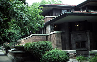
His other works don’t please the eyes as much as Fallingwater, yet they are still architectural masterpieces.  The other work of his mentioned in the book is the Robie house in Chicago.  While it doesn’t include a waterfall in the middle of the house, it is still gorgeous and really shows where he got his inspiration, from Asian architecture.  Asian architecture likes to use the principle of horizontality, by which the building might hug the earth.  Using that principle, Wright designed such houses as the Robie house.  Take a look at these pictures.  While the Robie house may seem toned down a bit, it is obvious to see where Wright got his inspiration and he mimicked the Asian architectural beauty very well.